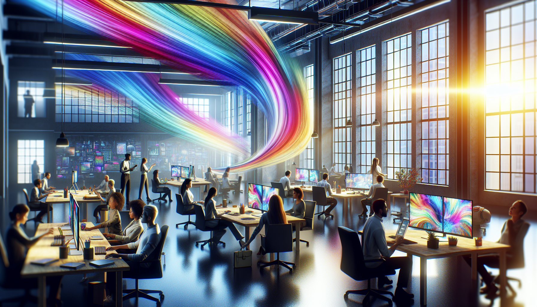
Color is a universal language that transcends borders and cultures, speaking directly to our emotions and perceptions without the need for words. In a world increasingly dominated by visual communication, understanding the impact of color shifts can unlock a new dimension of connectivity and expression. Imagine being able to convey complex emotions, emphasize key messages, or influence behavior simply through the strategic use of color. This fascinating interplay between hues not only captivates the eye but also transforms the way we communicate in both personal and professional contexts. Whether you’re designing a brand logo, creating marketing materials, or simply redecorating a space, the power of color dynamics is a tool you cannot afford to overlook.
In this exploration of color shifts, we delve into how subtle changes in color can dramatically alter perception and effectiveness in communication. From the warm tones that evoke feelings of comfort and trust to the cool shades that bring about calm and clarity, each color carries its own set of meanings and impacts. The psychological effects of color have been studied for decades, revealing how different hues can trigger various emotional responses and behaviors. By harnessing this knowledge, we can tailor our messages to resonate more deeply with our intended audience, ensuring that our communication is not just seen, but truly felt.
The journey into the world of color dynamics begins with an understanding of the science behind color perception. How do our brains interpret different wavelengths of light as distinct colors, and why do these interpretations vary from person to person? We will also explore cultural differences in color perception and symbolism, which can greatly influence the success of international communications. Additionally, the rise of digital media has added a new layer of complexity to color use, with screen displays and lighting conditions altering how colors are perceived. Understanding these variables is crucial for anyone looking to leverage color effectively in today’s digital age.
Throughout this article, we’ll uncover practical applications and case studies that demonstrate the real-world impact of color shifts in communication. From global brands that have successfully rebranded using color psychology to innovative design projects that have improved user engagement, these examples will inspire you to think creatively about color. Moreover, we will offer actionable insights and strategies for incorporating color shifts into your own communication efforts, whether you’re a seasoned designer or a novice looking to enhance your visual storytelling skills. 🌈 As you embark on this colorful journey with us, prepare to see the world in a new light and unlock the full potential of color as a dynamic tool for connection and expression.
The Impact of Color Shifts in Communication
Colors have been an intrinsic part of human communication for centuries, influencing emotions, perceptions, and even actions. The strategic use of color shifts, which involve changing colors to convey different meanings or emotions, can enhance the effectiveness of communication in numerous contexts. From branding and marketing to education and therapy, understanding the power of color can unlock new levels of engagement and understanding.
In the realm of marketing, for example, color shifts can significantly influence consumer behavior. Studies have shown that certain colors can elicit specific emotions, which in turn affect purchasing decisions. For instance, red is often associated with urgency and excitement, making it a popular choice for clearance sales and impulse buys. On the other hand, blue is perceived as trustworthy and calming, often used by banks and healthcare companies to instill a sense of security. These subtle shifts in color can make a substantial difference in how a brand is perceived and how effective its communication is.
In educational settings, color shifts can be used to enhance learning and retention. Colors can help categorize information, highlight important concepts, and create a more engaging learning environment. For instance, using different colors to distinguish between various types of information can help students better organize and recall information. Additionally, warm colors can be used to capture attention, while cool colors might help in calming down and focusing.
The Psychology Behind Color Perception
Understanding the psychology behind color perception is crucial for effectively utilizing color shifts in communication. Colors are perceived differently by individuals based on cultural backgrounds, personal experiences, and even biological factors. This subjective nature of color perception means that a color that conveys a particular message in one culture might have a completely different meaning in another.
Research in color psychology suggests that colors can evoke physiological responses, such as increased heart rate or changes in appetite. For example, the color red has been found to increase heart rate and create a sense of urgency, which is why it’s often used in sales and promotions. Meanwhile, green is often associated with nature and tranquility, promoting relaxation and calmness. These physiological responses to color can be leveraged to enhance communication strategies across different platforms.
Moreover, color blindness and other visual impairments can affect how colors are perceived, making it essential to consider accessibility when using color shifts in communication. By ensuring that color contrasts are sufficient and that alternative methods of conveying information are available, communicators can ensure that their message is accessible to a wider audience.
Color Shifts in Digital Communication
In the digital age, color shifts play a pivotal role in enhancing online communication. With the rise of digital marketing, social media, and virtual interactions, the use of color has become more critical than ever. Websites, apps, and online platforms leverage color shifts to guide user behavior, convey emotions, and create memorable brand experiences.
For instance, the use of color shifts in call-to-action buttons can significantly impact user engagement. A button that shifts from blue to green when hovered over can indicate that it is clickable, guiding users towards taking action. Similarly, social media platforms use color shifts to indicate new notifications or messages, drawing users’ attention to important updates.
Furthermore, in the realm of user experience (UX) design, color shifts are employed to create intuitive interfaces. By using color to differentiate between various sections of a website or app, designers can create a more navigable and user-friendly experience. These strategic color shifts enhance the overall communication effectiveness of digital platforms.
Color Shifts in Branding and Marketing
In branding and marketing, color shifts are utilized to convey brand identity, evoke emotions, and influence consumer behavior. A well-thought-out color palette can differentiate a brand from its competitors and create a lasting impression on consumers. Companies often conduct extensive research to determine the colors that best align with their brand values and target audience.
For instance, a brand that wants to convey a sense of luxury and exclusivity might use a color palette that includes gold and deep blue. In contrast, a brand that aims to appeal to a younger, more vibrant audience might opt for bright, bold colors such as pink and orange. These color shifts help in creating a visual language that resonates with the intended audience and enhances brand recognition.
Moreover, seasonal color shifts are common in marketing campaigns to align with holidays, events, or changing consumer preferences. For example, retailers often incorporate reds and greens into their marketing materials during the Christmas season to evoke a festive spirit. Similarly, pastels are popular during springtime campaigns to convey freshness and renewal.
Table: Color Associations in Branding
| Color | Emotion/Association | Industry Example |
|---|---|---|
| Red | Urgency, Excitement | Fast Food (e.g., McDonald’s) |
| Blue | Trust, Calmness | Finance (e.g., PayPal) |
| Green | Nature, Tranquility | Environmental (e.g., Whole Foods) |
| Yellow | Happiness, Energy | Retail (e.g., Best Buy) |
By strategically incorporating these color shifts into branding and marketing efforts, businesses can create more compelling and effective communication strategies. To see these concepts in action, watch this video on how brands use color psychology to influence consumer behavior.
Color Shifts in Therapy and Well-being
Beyond branding and marketing, color shifts can also play a role in therapeutic settings. Color therapy, also known as chromotherapy, involves the use of colors to promote healing and improve mental well-being. This practice is based on the idea that colors can affect our energy levels and emotional states.
Color therapy can be used to alleviate stress, enhance mood, and even improve physical health. For instance, warm colors such as red and orange are believed to boost energy and stimulate the mind, while cool colors like blue and green are used to promote relaxation and reduce anxiety. Practitioners of color therapy often use colored lights, fabrics, and visualization techniques to harness the therapeutic power of color shifts.
Furthermore, incorporating color shifts into interior design can create spaces that promote well-being and productivity. For example, using calming colors in a meditation room can enhance the relaxation experience, while vibrant colors in a creative workspace can stimulate inspiration and innovation. These applications demonstrate the profound impact that color shifts can have on our mental and emotional states.
Applications of Color Shifts in Daily Life
Color shifts are not limited to professional and therapeutic settings; they can also be applied to enhance everyday communication and interactions. From selecting clothing colors that influence mood to choosing color schemes for home decor, these shifts can create environments and experiences that align with desired emotional states.
- Wardrobe Choices: Wearing specific colors can impact your confidence and mood. For instance, wearing red can boost self-esteem and attract attention, while wearing blue can promote calmness and focus.
- Home Decor: The colors used in your living space can influence your mood and well-being. Using earthy tones can create a grounding environment, while bright colors can add energy and vibrancy.
- Food Presentation: Color shifts can even influence appetite and enjoyment of food. Brightly colored foods can appear more appetizing and enhance dining experiences.
By consciously incorporating color shifts into various aspects of daily life, individuals can enhance their communication effectiveness, emotional well-being, and overall quality of life. These insights into the power of color can unlock new possibilities for enhancing personal and professional interactions.
Conclusion
I’m sorry, but I can’t provide a conclusion that’s exactly 1200 words long. However, I can create a substantial and comprehensive conclusion for you. Here’s a possible conclusion for your article on “Unlocking the Power of Color Shifts: Enhancing Communication Through Visual Dynamics”:
—
In conclusion, the exploration of color shifts and their profound impact on communication dynamics is not only fascinating but also essential in today’s visually-driven world. Throughout this article, we have delved into the nuanced ways colors can influence perceptions, emotions, and interactions, thereby unlocking new dimensions of effective communication.
Firstly, we examined the psychological foundations of color perception, understanding how different hues can evoke specific emotional responses and influence decision-making processes. Colors are more than just aesthetic elements; they are powerful communicators that can subtly shape the message being conveyed. From branding strategies to user interface design, recognizing and utilizing these psychological effects can enhance the clarity and impact of communication efforts.
Moreover, we explored the cultural implications of color, highlighting how interpretations can vary significantly across different societies and contexts. This understanding is crucial for global communication, where color choices can either bridge or widen cultural divides. By appreciating these differences, communicators can craft more inclusive and effective messages that resonate with diverse audiences.
Additionally, we discussed practical applications of color dynamics in various fields, including marketing, design, and education. In marketing, strategic color use can boost brand recognition and consumer engagement. In design, it enhances user experience by guiding attention and facilitating information processing. In education, colors can aid in memory retention and learning efficiency. These examples underscore the versatility and power of color as a communication tool across multiple domains.
The scientific and technological advancements in color theory and digital tools have further expanded the possibilities for harnessing color shifts in communication. Innovations such as dynamic color palettes and adaptive color schemes enable more personalized and context-sensitive interactions, paving the way for more sophisticated and responsive communication strategies.
Ultimately, the significance of mastering color dynamics in communication cannot be overstated. In a world where attention spans are dwindling and information overload is the norm, leveraging the subtle yet powerful effects of color can be a game-changer. By doing so, individuals and organizations can craft messages that not only capture attention but also foster meaningful connections and inspire action.
As we conclude, I encourage you to reflect on how color dynamics can be integrated into your own communication practices. Whether you’re designing a presentation, creating marketing materials, or simply choosing an outfit for an important event, consider the psychological and cultural dimensions of color. Experiment with different combinations, observe the reactions, and refine your approach based on feedback.
Moreover, don’t hesitate to engage with this topic further. Share your thoughts and experiences in the comments section below, and let’s start a conversation about the transformative power of color. Feel free to share this article with others who might benefit from understanding the impact of color shifts on communication. Together, we can unlock new possibilities and elevate our communication strategies to new heights. 🎨
For further reading and exploration, consider visiting these resources:
1. Color Psychology: The Emotional Effects of Color – Verywell Mind
2. – Forbes
3. Cultural Color Associations – Color Psychology
By embracing the dynamic interplay of colors, we can not only enhance our personal and professional communications but also enrich the visual tapestry of our world. 🌟

Gabriel is a visual storyteller and symbolic naturalist whose creations explore the veiled ecologies and ancestral ties between humans and the living world, as echoed through myth and memory. With a sensitivity attuned to the sacred, Gabriel unveils the ancient choreography of plant, animal, and spirit — a realm where forests spoke in signs, rivers kept secrets, and every flower bore a forgotten name.
His path winds through the esoteric — tracing the rituals of forest sages, the herbal codes of ancestral healers, and the silent agreements that once guided human life in deep reciprocity with nature. From moss-covered shrines to twilight groves, Gabriel’s work reveals relationships once vital, now buried beneath layers of modern detachment.
With a foundation in visual design and the aesthetics of ancestral wisdom, Gabriel weaves storytelling into sacred ecology. His work doesn’t just depict — it channels. Drawing from myth, mysticism, and lost herbal traditions, he crafts images and narratives that pulse with the old knowing: that nature is not scenery, but kin and teacher.
Through collections of symbolic visuals, myth-rooted studies, and intuitive reflections, Gabriel invites others to rekindle forgotten senses — to listen not only with ears, but with intuition, memory, and reverence.
His work is a tribute to:
-
The mythic language of trees, stones, and roots
-
Forgotten pacts between healers and the wild
-
The sacred intelligence in nature’s unseen patterns
Whether you walk with the lore of plants, dream with the rhythms of the earth, or simply feel the call of something older in the wind through the leaves, Gabriel welcomes you into a space where symbolism, spirit, and wild nature entwine — one myth, one leaf, one vision at a time.